By Christopher Hester 17th October 2011 · Last updated: 17th October 2011 · Based on my iPad Spectrum Comparison Review post.
Here's the demo in action below. Text should flow smoothly around the circle in the middle. Now read the Notes to see how it was done, check browser support, and learn of any issues I found.
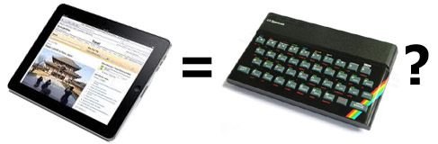
The iPad is surely the modern equivalent of the Sinclair Spectrum home computer from the Eighties. Similar in size and shape, both can only run one program or task at a time. Both are limited in memory and capability compared to larger computing devices. Both machines challenge the user to do more with less.
Although sound and graphics were poor on the Spectrum, it didn't matter. It rocked. This tiny machine revolutionised the UK home computer market, leading to a wave of add-ons and dedicated magazines. It was seminal, a landmark in the history of personal computing.
While the cheapest Spectrum came initially with just 16K of memory, today the cheapest iPad comes with a 16Gb flash drive. Of course the Spectrum had to be connected to a television to see anything, while the iPad has a built-in touchscreen.
Both have keyboards. The Spectrum's was rubber, with painted lettering on the keys that wore off after time. The iPad has an on-screen keyboard, or you can hook it up to a dock for heavy typing. Later versions of the Spectrum had plastic keys instead of rubber.
The iPad is sure to become as equally groundbreaking as the Spectrum. Hopefully it will be continuously improved over many years, following the evolutionary pattern of the much-loved iPod. Future improvements are anyone's guess, but it's an easy bet that, beside the likely addition of multitasking, there'll be more memory added, a faster processor and maybe a higher resolution or larger screen. Should be good.
One last thing. There's already a Spectrum emulator app for the iPad called ZedX. History repeating itself?
I was inspired by magazine layouts I saw which made use of quotes in circles between columns of text. In print, columns of text are able to flow naturally around an object (even irregular shapes). So why can't text on the web do the same? It can. But it needs a bit of effort.
The red circle you see is a 200 pixel by 200 pixel image I made. I saved it as a 24-bit PNG, so the edges are smooth, and it can sit nicely over a background colour or other image. The circle is then applied as a background image to a set of divs, which are stacked on top of each other. I got this idea from the wonderful Ragged Float demo by Eric Meyer. However, rather than cut the image up into separate slices, I made just one image. I positioned it inside the divs at different places to give the effect of the original circle. Each div, or slice, was made just wide enough to incorporate the edge of the circle. The result is that text can now flow around the slices. All that's needed then is a margin around the slices to keep the text away from the edges of the circle.
The slices are also cut down the middle, giving you a left stack and a right stack. This is because the text is in two columns, which I have floated together. The circle is thus split in two. I'll say more about this in a bit.
Have a look through the code of this page to see how it works.
The text in the circle is created inside the first slice, so it can be positioned relatively to the top of the circle. I then split the words into spans so I could put them on separate lines and move them left or right to line them up. Lastly I rotated the text by 7 degrees, to further mimic layouts used in magazines.
Glad you asked. Because a single image is used, and no slicing required, it will be a simple matter to swap it for another image any time you want to update the page. Don't like red? Prefer yellow? Not a problem. Want a fancy border inside the circle? Just add it! I guess animation is also possible, but I'll leave that to your imagination...
The main problems I found are browser differences. For some reason, Chrome* appears to fail to respect the margins in the top rows of the image slices. So text can run right to the edges of the image. Oddly, this gets better as the rows move down - the bottom half is fine. The first row seems to be okay, but the second one is right up to the slice. (You can see this by adding an outline to the elements on the page.) And yet if you move the circle lower down in the text, the problem vanishes.
This also affects Safari*. In Firefox*, Opera* and Internet Explorer*, the text flows as expected, with equal space before each slice.
Another problem is that the circle is split into two halves. Thus if the page is zoomed in enough, the floated text columns break up, and you only see half a circle.
* The browser versions I used were as follows, all on Windows XP: Chrome 14; Safari 5; Firefox 7; Opera 11; Internet Explorer 8.
Check the screenshot I made in Firefox and compare it to what you see!
If you have any comments on this demo, please send them to me via email. I'll publish any suitable ones here. Thanks!
Email: www.designdetector.com (replace the first dot with '@').