Inspiration
Date unknown · Last updated: 5th October 2016
When it comes to designing websites you might think to look at other websites first. Yet inspiration can come from anything that we see around us, in things that are far removed from the computer screen. If you're stuck designing a new layout, colour scheme or style for your site, take note of patterns and shapes when you're away from the computer.
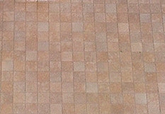
Here is an example. In our house, the toilet is in a separate room from the bathroom. I noticed one day how the tiles around the toilet were made from small squares of the same tan coloured shape, each having their own unique texture, and surrounded by a thin border. It made me think of the computer game Boulderdash where one level is made up of square rooms defined by walls, each of equal size, yet there was enough variation in each room to make it highly playable.
So how might this be useful? You might construct a page using coloured blocks of the same size, each with different content. Some blocks might have text in them, others images. Or you could use only one background colour and add a texture to the blocks to differentiate between them.
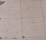
Now in the bathroom, the tiles are much larger, but heavily worn. One tile has a cracked corner which made me think of how you could add a corner cut to the blocks mentioned before, although this is a common sight on many design sites.
Cracked, rusty and damaged objects are another source for inspiration. Why not take a photograph of an old building close up, perhaps a shot of the wood in a rotting window frame or door. Then use part of this as a background for your main page.
I recently saw an article showing how an image was created from separate layers, one of which was a scanned cover of a battered old textbook. Try scanning anything you can find that has an interesting texture. Aim for something that won't be too obvious when it's on screen. Edit the scan - crop, filter and recolour it.
I once got a white jiffy postal bag through the mail which had a bubble pattern over it. The AIRMAIL frank stood out in jet black blurry ink - I just knew I had to scan it, and it made a great background.
Further inspiration can be found in the patterns of nature. Perhaps the way a tree branches out might help you come up with a site map for your pages? Or might the autumnal colours of red, green and yellow fallen leaves help with a new colour scheme?
You might say the layout of a page can sometimes have an almost architectural look, with lines and boxes. So take a look at modern buildings. The way window frames dissect the glass in different proportions. Or the way use is made of joined elements and lines necessary for the building. Try adding extra lines between elements on your page. Try adding a thick white border around photographic images to make them look like Polaroids or framed works.
Let's try an acid test. Looking around the room, I will try and find things which might give me inspiration for a style or layout. First off is the fan - it has a metal grille made up of diamond shaped holes. You could use them as a background pattern, or I thought of putting 4 coloured diamonds together to make a selection screen, each a link to a separate page. Then I realised the diamonds could be squares seen lying down in 3D. There are many great sites that use such an isometric view.
The fan also has a middle circular piece of metal with five unique slits in for no real reason. These are angled to look like five poles stood up, leaning over a little. The ends of the holes are rounded. I just know that would look great on a splash page if the pattern was copied into coloured graphics.
Turning left, I see a small black sheet with some stickers on it. There are quite a few round yellow stickers and one row of green ones. They look just like LCD dots. You could easily copy that for computer-style lettering or shapes. The green line of dots could be made to flash repeatedly left and right as if part of a machine, for that technical look. Or the bunch of yellow stickers could form a random set of circles that changed by having some of them appear and disappear to grab the user's attention.
Next I can see a radiator which has long rounded panels indented and repeated across the surface. They look like the Roman olympic tracks that athletes might run around, lap after lap. Also the shape is like a stretched letter "O". Why not make a page using this shape? The top would be curved in a pure semicircle, with room for square adverts in each corner perhaps. Then the majority of the page would run down as normal, before ending in another semicircle where the credits might go.
That's quite a few ideas from looking around the room, and I haven't even turned the chair round yet. If one room can yield so many ideas, what might the outside world give you? A never-ending supply of inspiration - if you know where to look.
As an example of inspiration at work, take a look at these websites:
The Junkyard is the work of David Townsend, who has created a site based on images of scrap metal. This not only gives him the background images, but also a theme, as seen by the use of machine-like buttons on the menus.
Cam's Happy Pencil features an interface in the shape of a tree where words (links) grow onto the branches. Further in, a wooden box spins round to show new sections. Look out too for the eerie eyeball that watches where your mouse goes.