Bad Design In Programs
25th November 2003 · Last updated: 5th October 2016
Ever used a program and got a meaningless pop-up message? Or been frustrated when the program doesn't allow for your setup? If so, then check these I've come across.
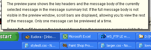
In Eudora, the programmers clearly haven't considered anyone setting the Windows taskbar any higher than its default setting of one row. The result is a help message that cannot be scrolled to see the hidden text. And what if the user has a smaller screen size? Even more text wil be hidden. So stupid.
 Also in Eudora comes a puzzling change to the way buttons are used in Windows. Someone had the bright idea of listing text for a directory over a button! The text is naturally cut off - it does not fit the shape of the button. And why confuse users? A button is meant to activate something, not to display text in this way. The text should be listed (in full) underneath, while the button should say something like "Change Sound".
 Here's another example from the same program. Here, the button is blank because the user has yet to select an Attachment directory. So why doesn't it say "Choose Directory"? A confusing and silly way to use buttons.
Lastly, what a laugh this error message from Nero Wave Editor is. Which button is the user supposed to click? I tried the Yes button and the program closed!

Comments (5)
Comments are locked on this topic. Thanks to everyone who posted a comment.
Chris, a one-liner for you:
Have you considered using Opera's M2?
M.
p.s. The last popup message reminds me of Dreamweaver popups, just as empty, except that I get a cascaded series of about 10 before the program crashes with a bang. It happens 90% of the time when I close a tab which is the last one open. Sometimes I do it just for fun. I wish I knew how to record videos from screen (don't know the jargon). I could send it to Macromedia Bozos as a Thanksgiving Egg
Posted on 26th November 2003 at 3:55 am 
*chuckles* Design flaws are almost everywhere you could think of. Obviously, software developers need to think out-of-the-box to accomodate future compatibility and backwards-compatibility as well.
Posted on 26th November 2003 at 4:06 am 
"Have you considered using Opera's M2?"
We have to use Eudora at work, see. (Or something very primitive called Exec Mail.) I did used to use Outlook Express, which wasn't recommended by our IT department. I soon found out why - deleted mail wasn't deleted on the server, leading to my mailbox running out of room one day!
I'm not mad about Eudora, but it's quite a capable program (it often gets good reviews).
Just give me Outlook Express! (No, really. It's safe once you switch off the viewer pane. And even with it on (so you see messages without opening them) I've never had any problems with it at home.)
I did hear from a friend who once got a virus using it, but Microsoft have patched that bug now.
I haven't tried Opera's mail program yet, maybe I will one day. What about Mozilla's? Or Thunderbird? Any good?
Posted on 26th November 2003 at 9:06 am 
Opera M2 is a real cool software, if u get the hang of it. It's real good at what it does but can get a bit complicated for a layman. Thunderbird is OK too. But its too big for my taste. Opera M2 is a 300 K plugin sort of thing to 3.5 meg excellent browser. Thats technological marvel for u :)
and design flaws? Opera has 1, Image property box has 2 buttons. OK and Cancel. Both does the same thing!
Posted on 26th November 2003 at 5:40 pm 
IE6? Utterly pathetic. What a useless piece of rubbish. A poor excuse for a browser. Why? Because the first image on this page (the Eudora tooltip) has had to be cut right down in width to please it. Originally it stretched too wide, overlapping the gap between the columns. Other browsers like Opera 7 had no problems still rendering the page properly. But IE6? Oh no. It gave me the 'dropped float' problem, where the side column is put right at the bottom of the page!
I took screenshots and measured the maximum width I could make the image, taking into account the borders and padding I'm using round each image. Yet it was STILL TOO WIDE FOR IE6! Even though in Photoshop the image now fitted flush with the third one, which is floated right.
I kept testing (more like wasting my time) until I got a max width of 500 pixels before IE6 would ruin the layout. So apologies if the image now has too much cut out or looks a bit short.
I've seen this 'dropped float' problem before, when simple italics can affect IE6's pathetic box model. (Next time guys, follow the standards, eh?) Indeed there's even an article on this and other IE6 problems here. If you're making any kind of layout I'd advise reading it if you want to avoid the problems IE6 gives you. In the meantime, if you see anyone still using IE6, tell them to switch to Opera or Firefox immediately!
http://positioniseverything.net/articles/common.html
Posted on 20th October 2004 at 8:40 pm 