Fresh Layout For New Design Portal
26th September 2003 · Last updated: 5th October 2016
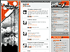
Take a look at Mi3 for an example of an intelligent and fresh layout. It's a design portal with tutorials, a gallery of work by new artists, interviews, a forum and much more. I like the simple use of two main colours, with Flash sparingly used to subtle effect. This is the way more sites should be made.
Comments (8)
Comments are locked on this topic. Thanks to everyone who posted a comment.
yeah, your right. the design idea is good. i just have the problem that not all borders fit correctly and the choosen main font is too small and (a bit) ugly for me in mozilla 1.4.
Posted on 27th September 2003 at 4:24 pm 
in mozilla 1.3 looks brilliant
Posted on 28th September 2003 at 2:57 am 
Trying too hard, and failing. Personally I feel it stinks; design-wise.
Some problems:
It doesn't scale to the width of the browser; I have to scroll to the right to see the site. (I have 1280x1024, Opera 7.21, with bookmarks to the left and a width which makes the browsing of those acceptable)
All the vertical lines are busy, they force my eye to concentrate too hard to read the info in the center column... My actually runs back and forth between the two blocks of vertical lines if I don't concentrate.
Too small original font; when using Opera's zoom feature, the problem with horizontal space increase.
Too much space vasted with the flash. I don't have flash, so if there is navigation there I haven't seen it. This space also pushes the right hand out of the viewport
I won't comment on the source of the site, it reminds me of a hopeless recoding job I had to do for a client.
Finally, I would have moved the work of new artists a bit higher up for visibility. It is probably as interesting as the latest forum postings (at least for us that doesn't speak the language used; what is it anyway, serbian?)
Posted on 25th October 2003 at 4:02 pm 
Hi. First, thank you for commenting.
disclaimer: sorry for bad english, its not my first or second languague... its third, so... :)
1. site is 1000px wide -> so it fits in 1024x768 resolution w/out horizontal scroll. it even fits in opera 7.12@1280 with favorites bar on but the bar has to be set to default width.
2. target audience for the site are croatian designers (web¦print)
They have large resolutions (and monitors), becouse its pain to desing in 800x600 or 1024x768, so we didnt focus on 750px.
3. you dont have flash plugin installed
If you dont have flash plugin installed, you cant coment on design because you are missing 1/5 (cca) part of site. Vertical lines are not busy with flash, because that part neutralises vertical lines (you can see only that, so its normal that they look busy to you...).
We need that flash space for future mi3 development -> for now its only eyecandy.
4. source
What exactly do you mean by 'won't comment on the code'? Have you tried to run it through html validator?
5. you dont understand our languague
If you cant understand our languague, you cant suggest us what is important on site and what is not. News are not important for you, latest comments are not important to you... you cant read it and you cant understand it. But for croatian speaking people, those things are very important - specialy on start page.
We made this site for croatian (or croatian speaking, at least) people only, not for others. Otherwise, we would translate it to english.
Font size is 11px. Too small?
Posted on 29th October 2003 at 12:34 pm 
>>They have large resolutions (and monitors), becouse its pain to desing in 800x600 or 1024x768, so we didnt focus on 750px.
Its pain to design anything in 800x600 or 1024x768 (specialy print design) - its not pain to design TO 800x600 resolution :) - so designers have usualy bigger monitors than rest of the surfers.
Im not sure that this is written wright first time.
Posted on 29th October 2003 at 5:21 pm 
Hi Emptyhand,
Tnx for taking the time to comment on my comments :D
1. no problem, the only reason I'm going with 1280 x 1024 instead of my preferred 1600 x 1280 is that the price of an LCD monitor would double to get one which is good enough.
My point is that with proper HTML coding, the site would resize properly with the window.
2. Tnx, I thought as much, I'm sorry I can't discern between serbian and croatian, I hope I didn't step on anyones toes at suggesting the one as opposed to the other.
3. I opened IE and looked at your site. No, not better with flash. But, the problem is not at the top, it is a bit down the page, under the "Petraži" (search?) and where the user box starts.
At that point there are vertical lines on both sides of the content column, that's where I had my problem.
4. I didn't check in a validator. Though it might validate, it has far too many nested tables, it is a pain to read.
5. I'm thinking like this "pictures sell". It goes with show, don't tell. Of course I understood that the site wasn't for me since I don't understand your language.
I just think it is good advice. Bring images to the top and front. There is a reason why all newspapers and magazines do this.
And finally, if the site is about design, then I feel that it is apropriate.
When it comes to font size, it seems okay with 11 px, but the 9px isn't that good.
I've browsed the site, and you seem to have a good group of regulars there. I wish you luck with your site. I've also found some very cool art on and via your site, so thanks for the resource.
Posted on 30th October 2003 at 12:07 am 
Hi, Paul. Thx for c on c on c :)).
>> My point is that with proper HTML coding, the site would resize properly with the window.
I disagree. Even with 100% horizontal scalling, you have minimal resolution limit, so its not just "woohoo scaling". We set it to 1000px (i wrote the reasons in prevoius post).
+ i like the control over the space :).
>>Tnx, I thought as much, I'm sorry I can't discern between serbian and croatian, I hope I didn't step on anyones toes at suggesting the one as opposed to the other.
No problem. Languagues are similiar, its common mistake.
>>I'm thinking like this "pictures sell". It goes with show, don't tell. Of course I understood that the site wasn't for me since I don't understand your language. I just think it is good advice. Bring images to the top and front. There is a reason why all newspapers and magazines do this.
Market law is that most valuable item is item which is wanted and is not on market or in extremly low quantities.
On frontpage, we have focus on NEWS becouse (belivable or not) we are only site in croatia with news from web world. Here nobody offers news, we do - we focused on them - simple. That is why we put them on top.
Gallery has its own page (http://www.mi3dot.org/gallery) where focus is on images (you can sort gallery on: newest, new comments, rating). You can bookmark this page and focus on upper part of the site so you dont have to mingle with txt thingies :).
>>When it comes to font size, it seems okay with 11 px, but the 9px isn't that good.
11px font size is on things i want you to read. 9px size is on things that is not important to you, but if you really want to know -> here they are.
>>I opened IE and looked at your site. No, not better with flash. But, the problem is not at the top, it is a bit down the page, under the "Petraži" (search?) and where the user box starts.
True and not true.
First requirement is to understand our languague.
(ungh, im wrestling with english very hard now and i want to be brief :) - im not sure that i can explain it to you like i can on my languague :I - but if you can understand croatian, i wouldnt need to explain to you :)).
Lower part of mi3 site is "basement", its for those who "want to know more". Maybe better description is "fast food" or "quick check" if there is some activity.
I dont expect you to read that every time when you stop by, i expect you to do a quick check (mouse wheel down -> someting changed? -> no? -> mouse wheel up).
There are not newest images, there are displayed newest comments on images (its written on subitle ;).
This part have lesser importance then the upper part. Down right side of the site is not empty when you register. There is user menu and admin menu (if you are one) which covers part of the "_blank grey".
One more reason why this part is just "quick check" or "basement" is that you can "prepaid" on every picture that you like - i mean, you can get email notification every time somebody comment that picture. Also, you can "track user", so you will get email notification every time that user post something in gallery.
Im aware that this aproach is not "sex on the first date", but its great when you get hang on it, when you visit us more then once (and understand what is written). Then, you will like it. Actually love it ;).
>>I've browsed the site, and you seem to have a good group of regulars there. I wish you luck with your site. I've also found some very cool art on and via your site, so thanks for the resource.
Thank you very much. I hope that you will stop by from time to time (at least on gallery part :).
Once more, thank you for c&c's. I...
[Message truncated due to length.]
[Edited by Chris Hester. Reason: tidied line-breaks]
Posted on 30th October 2003 at 2:05 pm 
Once more, thank you for c&c's. I appriciate them. But, we didnt take "that would be cool, that to, that to" and just paste it on site. We had a good thinking before (20 word pages cca ;)) and than we start to draw and place elements on site. Site has a "tour guide", how we want you to browse the site but it all falls in the watter if you dont understand what is written bcause 70% of content is not interesting to you and then your system of value differences from ours.
I hope that i didnt sounded like some ashole in this post - like i said, im wrestling really hard with english and currently im all beaten up :).
Posted on 30th October 2003 at 2:06 pm 