HMV Digital Not Accessible
12th September 2005 · Last updated: 5th October 2016
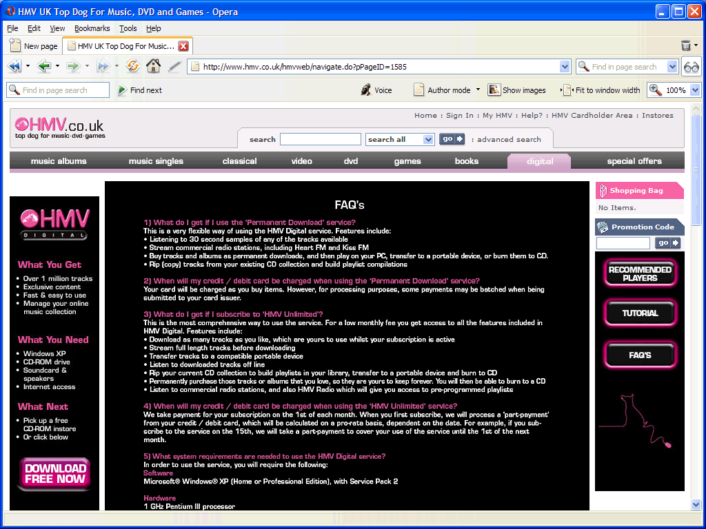
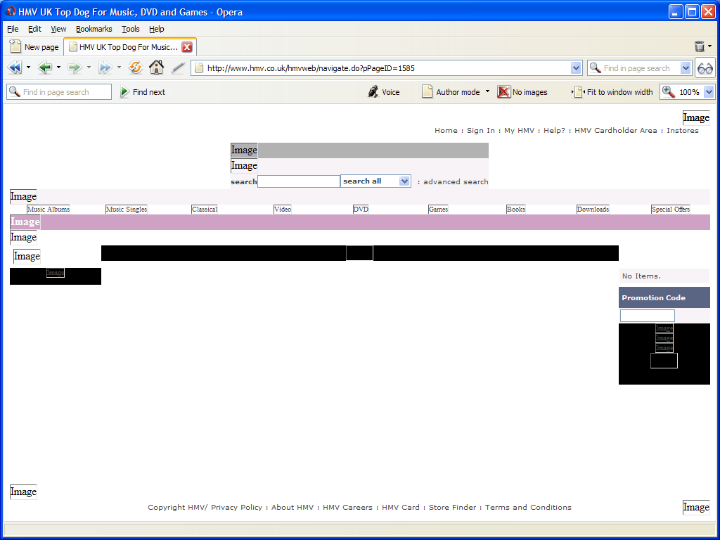
Q: What's wrong with this? (A screenshot from HMV's recently launched UK digital music service FAQ.)
A: This.
I'm tired of seeing this approach to web design. Clearly no thought has gone into making the image accessible. Indeed, why use an image at all? ("Because the boss wanted the standard font we use.") Then why not use Flash? Besides, I can't bear to read the text in the image used — it's that crunched up. Plus of course there's no way to enlarge it. (Opera can enlarge images, only the text looks even worse enlarged.)
HMV isn't the only site where I've seen this crime, but this is one of the worst examples I've seen. Designers, please learn about accessiblity, apply as much as you can, don't make such obvious mistakes. Think about a wide range of users who might wish to read your site. Blind or poor-sighted users have no chance of reading the content in the image you've used. The image is worthless in a speech reader. And what about a case where the image fails to load? Or the user wishes to enlarge the text or change the font? Otherwise you isolate users who can't read your content. I don't think such users will want to bother visiting your sites again. Can you afford to lose such potential sales?
I just noticed there's also a link in the image (see point 6), which says "click here". I'm clicking, I'm clicking! Nothing's happening! I'll have to copy the link and paste it into my browser instead. Oh wait, I can't.
Comments (6)
Comments are locked on this topic. Thanks to everyone who posted a comment.
- Dylan:
Wow. That is indeed a terrible bit of inaccessibility. I really don't see the need to resort to such horrid methods, and on such a high profile website…there's just no excuse. Plus the image takes up way more space kilobyte wise than the same length of text, and I don't think the font is important enough to resort to that crap, for one thing it's not even rendered well in the image! The unclickable link is just icing on the cake…maybe they should create an image map?!
I can't even see it being pure ignorance because they can't not know that what they're doing is totally stupid, unless HMV has hired some incredibly inept web designers…
They don't even specify any alt text, which I suppose would have to read something like "Uh, we're ignorant and stupid and we aren't going to do this the right way, so instead you don't get an image, and we lose a customer!", or, of course, the entire FAQ which would actually end up being pretty ironic…
Posted on 13 September 2005 at 1:28 am ¶ - Chris Hester:
Virgin Digital is even worse! The entire front page is one image. Turn images off and you get a huge blank grey area with just a bit of white text underneath.
http://virgindigital.com
But at least their FAQ is written in standard text!
Posted on 13 September 2005 at 7:53 pm ¶ - Roger Karlsson:
Here's another example:
http://www.funkanu.se/start.asp?sida=1021
Vattenfall generates and sells electricity, has more than than 33,017 employees and is owned by the Swedish state. They could do better.
Posted on 14 September 2005 at 8:35 am ¶ - Chris Hester:
Another one. None of the banner images using important information have replacement text at all. Plus the logo just says "Image".
http://services.google.com/university/
Posted on 14 September 2005 at 1:47 pm ¶ - Chris Hester:
The Metro travel website claims AA accessibility in its source code, but they have a row of language buttons that lead to a large image of text. Have they not heard of language encoding?
http://www.wymetro.com
There is a 'Text Only' link, but this removes the image buttons altogether.
Posted on 20 September 2005 at 12:56 pm ¶ - Sarah:
Yes, accessibility is something all companies should strive for…but before laying the blame at the designers' feet (they're ignorant, they're inept, etc.), consider the fact that they may have been overruled by key decision makers–over whom they generally have very little influence…especially with BIG companies (you know who I'm talkin' about). So, yeah, it's easy to trash a design (in fact, it's often quite enjoyable), but it's probably fairer to question the priorities of key decision-makers.
Posted on 4 October 2005 at 6:03 pm 